Chapter 1.1: A-Frame Item Cards
Over the last few days, I’ve been working on the layout of the item cards for the A-Frame chapter of this series.
Here is a link to the CodeSandbox for this post. I’ll refer to a few components and files throughout this article. Before describing the Item Cards, I want to touch on a few changes since the last update.
Moving things around
I started by making a new SceneController component that can serve as a container for the A-Frame scene and any logic that needs to be run at that level. This let me clean up the App.vue file. The SceneController gets some data from the API and uses the template section to layout the A-Frame scene.
I wanted an easy way to work with a handful of colors throughout the app, so I made an object called Brand and created properties for each of the hex colors that I used on the Extended Collection website. I imported this object and set it up for global access using Vue.prototype.
// main.js
import { brand } from "./helpers/brand.js";
Vue.prototype.$brand = brand;
This lets me use the named colors throughout this project. For example:
<a-box :color="this.$brand.gray2"></a-box>
I also copied the 3D logo that I made a few months ago and added it as a component called Logo3D.
Item Card Layout
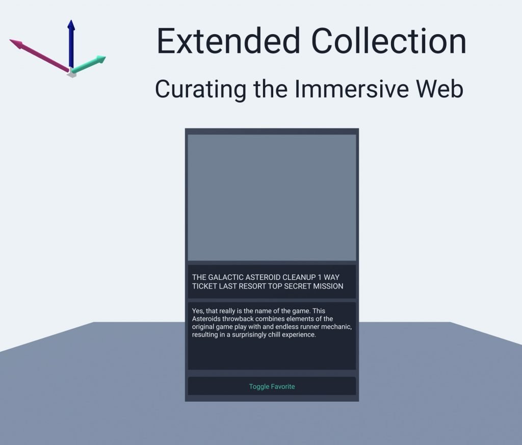
My main goal at this point was to block out a card layout that I can reuse for each of the library items pulled from the API. I’ll work on the visual design a bit more down the road. For the time being, I used a few A-Frame boxes to create the structure that I want. The cards need to have a few items.
- Image
- Title
- Description
- Button – toggle favorite status
I decided to use aframe-troika-text over the built-in text features because troika offers a bit more control and makes it easy to work with font files.
One thing I know for sure is that I want all the cards to be the same size. I can’t rely on the text objects to determine the amount of space a section will take up, because the text object height changes automatically to fit the amount of text they have. I worked around these limitations by using some boxes to layout the card. Then I placed the text objects inside the boxes. That worked well for visual structure and layout, but the text could still overflow these boxes. My hacky workaround for that was to truncate the text after N number of characters. I have a stubbed method called trimString(value, maxChar) that does just that.
The SceneController hardcodes a single version of the new ItemCard3D component. In the next chapter I’ll start loading the cards dynamically from the API data.

Issues with Images
I added a new component to handle the image. This component fetches the featured image from the post item, then passes it to an a-image entity. At this point, I don’t have this working. I’m not sure what the issue is. I don’t think it’s a CORS issue since I already updated the server, and I can load these images in the 2D version of the project. This might have something to do with the way that A-Frame loads assets, but I’m not sure.
I didn’t spend much time on it because I won’t be able to use a-image anyway. It lacks support for aspect ratio cropping. For now, I’m going to leave the placeholder section for the image on the card. In the future I’ll look at making a new A-Frame component that can crop and display the images that I pass it to.
